
Back to Homepage
Knowledge Hub

Amazon Design Insights

Expert guides, case study analyses, and advanced strategy recommendations to help Amazon sellers maximize CTR and conversion rates.

Amazon Listing CTR Tips
July 28, 2026 5 min read

5 Critical Mistakes to Avoid on Your Amazon Listing Images
Discover why most Amazon sellers fail to convert traffic into sales and how visual psychology can double your click-through rate.

Read Full Guide
A+ Content Layouts
July 15, 2026 8 min read

The Power of A+ Content: How to Build Trust and Lower Returns

Learn how to use comparison tables, cross-selling modules, and realistic 3D renderings to answer customer objections before they buy.

Read Full Guide
Midjourney AI Renders
June 30, 2026 6 min read

AI + Photoshop: The Future of Amazon Lifestyle Renders

Traditional product photography is expensive and slow. Learn how we combine advanced AI generation with manual Photoshop editing to deliver premium visuals.

Read Full Guide
Conversion Rate Optimization July 28, 2026 • 5 min read

5 Critical Mistakes to Avoid on Your Amazon Listing Images

Amazon Listing CTR Tips

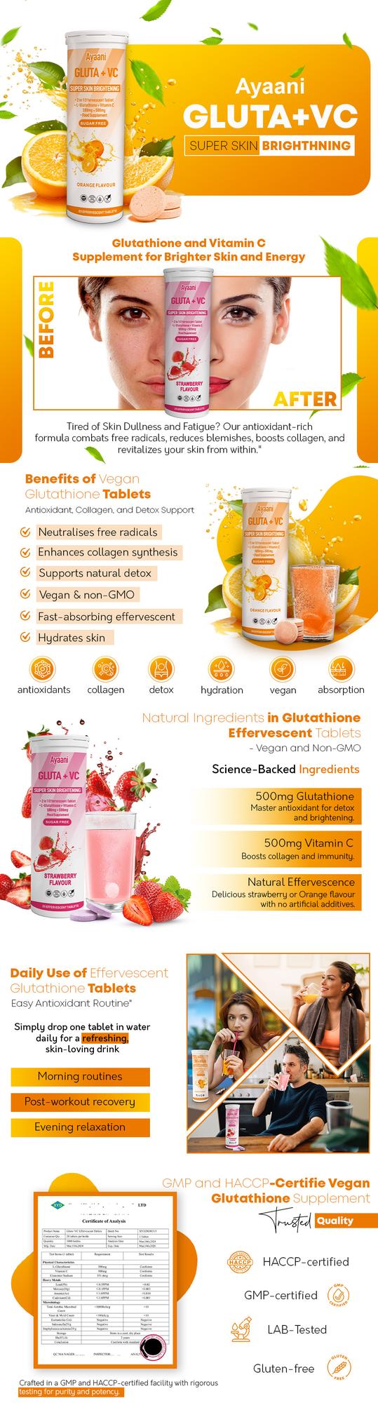
Amazon is a highly visual marketplace. When a customer searches for a product, they don't read bullet points or descriptions first—they look at your images. In fact, mobile shoppers often make a purchase decision purely based on the main image and listing graphics. Yet, 90% of private label sellers make visual design mistakes that cost them thousands of dollars in lost conversions. Here are the 5 most critical mistakes and how to fix them:

1. Hard-to-Read Text on Mobile

Over 70% of Amazon buyers shop using the mobile app. Many designers place long paragraphs or tiny text labels on listing images. On mobile screens, this text becomes unreadable, prompting users to swipe away. Keep text short, punchy, and use a minimum of 24pt bold sans-serif fonts.

2. Focusing on Features Instead of Benefits

A feature is what your product *has*; a benefit is what your product *does* for the customer. For example, instead of just labeling "2.4L Water Capacity", show a graphic explaining: "Fills 10 Standard Glasses - Keeps Your Family Hydrated All Day." Speak directly to the buyer's needs and pain points.

3. Poor Competitor Comparison Charts

If you include a comparison chart, don't make it look biased or generic. Avoid simple red X's and green checkmarks. Use text and concrete details to show exactly where your product outperforms competitors (e.g., "100% Paraffin-Free Wax" vs "Synthetic Paraffin Mixture").

4. Boring Main/Hero Images

The main image is responsible for your Click-Through Rate (CTR). It must have clean packaging, perfect lighting, and take up at least 85% of the frame. Ensure the product angle shows depth (three-quarter views are usually best) rather than a flat front-facing view.

5. Inconsistent Brand Style

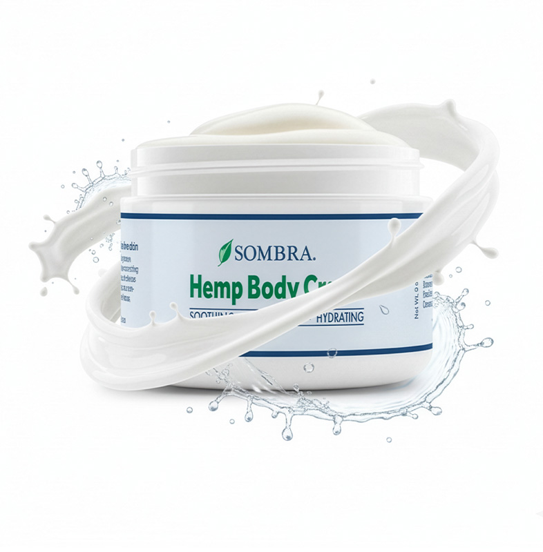
Using different fonts, color themes, and lighting setups across your listing images looks unprofessional and reduces brand trust. Establish a clear styling system—like Sombra's soothing warm botanical theme or Amer-Ice's patriotic red and blue colors—and keep it unified.

A+ Content Strategy July 15, 2026 • 8 min read

The Power of A+ Content: How to Build Trust and Lower Returns

A+ Content Layouts

Amazon A+ Content (formerly Enhanced Brand Content or EBC) is one of the most powerful tools available to brand-registered sellers. Placed right under the product description, A+ content uses rich modular layout banners, comparison charts, and brand stories to engage shoppers. When designed strategically, A+ content can increase conversion rates by up to 20% and significantly lower return rates. Let's look at how to layout A+ modules for maximum impact:

1. Address Friction Points Early

Before a customer buys your product, they have questions and doubts. Use A+ modules to address these doubts visually. For example, if you sell a granulated sand candle, use a custom graphic module to show step-by-step how to pour the wax, insert the wick, and burn it safely without making a mess.

2. Deploy a Brand Comparison Table

The standard product comparison table module is the highest-converting element in A+ content. It allows you to cross-promote other products in your catalog, helping customers find the exact variant they need and increasing your average basket size. It also acts as an excellent barrier to keep customers on your listings rather than clicking on sponsored competitor ads.

3. Mix Modular Banners with Close-up Renders

Don't just upload blocks of text. Design wide, full-width headers (970x600 px) that create a cinematic brand presence. Zoom in on unique product textures—like the clean botanical ingredients in Moringa Bitters or the silicone weave of Slecon gun cleaning cloths. Show quality up close to build customer confidence.

4. Build for Mobile Responsiveness

Amazon automatically rescales A+ content modules for mobile screens. Ensure your text layouts are centered, spacing is optimized, and background graphics don't crop out important features when viewed on small mobile displays. Keep A+ text segments descriptive and distinct from the image assets to support Amazon SEO indexation.

AI Visual Production June 30, 2026 • 6 min read

AI + Photoshop: The Future of Amazon Lifestyle Renders

Midjourney AI Renders

As an Amazon seller, your biggest marketing expense is often product photography. Hiring a local studio, finding models, preparing sets, and waiting for the right weather conditions can take weeks and cost between $1,000 to $3,000 per project. Fortunately, next-generation AI tools like Midjourney, Flux, and Photoshop Generative Fill have completely revolutionized this workflow. Here is how we combine AI and manual photo-editing to deliver studio-quality renders at a fraction of the time and cost:

The Problem with Raw AI Output

While AI can generate stunning images, it is notorious for being inaccurate with product packaging. If you ask an AI to generate "a blue bottle of Colsigen Mist spray on a marble bathroom vanity", the bottle will look fake, the text will be gibberish, and the dimensions will be distorted. To stand out and comply with Amazon rules, you cannot use raw AI-generated bottles.

The Synthesis: AI Background + Photoshop Precision

Our hybrid design workflow solves this problem in three precise phases:

  • Step 1: High-End Background Generation: We use Midjourney or Flux to prompt ultra-realistic, lighting-perfect background scenes matching your brand aesthetic (e.g. natural warm cedarwood backdrop, modern luxury spa marble counters).
  • Step 2: Photoshop Precision Integration: We manually extract your physical product package from a high-resolution flat photo or CAD rendering. Using Photoshop tools, we place it into the AI-generated background scene.
  • Step 3: Realistic Lighting & Shadows: We draw custom reflections, match the background light direction, generate accurate ground contact shadows, and perform high-end color grading to make the product blend 100% realistically.

Why This Workflow Wins

This workflow enables us to deliver:

  • Unlimited Settings: We can place your product in a kitchen, gym, log cabin, or sandy beach within minutes.
  • Fast A/B Testing: We can swap backgrounds easily to test which environment converts best for your buyers.
  • Budget-Friendly Renders: We eliminate expensive photography rentals and pass those savings directly to you.